|
Image by Ria Sopala from Pixabay
It has been a while since I reported last. The fall numbers are rising everywhere, and some are beginning to panic. The second wave is coming ...... but should we be worried? Two months ago Drosten speculated the virus is mutating and weakening (related article in German). I believe I already passed another article on, but to recap, here it is again: Will mutations soon make COVID-19 less harmful?
Apparently so, if one follows the numbers. More and more people are getting tested, are positive, but have no symptoms or only very mild symptoms. The death rates are flat, hospitalisations are down as well. Below, I republish an article from THE CONVERSATION. My previous post also talks about not to panic: CORONAVIRUS REINFECTION – WHAT IT ACTUALLY MEANS, AND WHY YOU SHOULDN’T PANIC Coronavirus: why aren’t death rates rising with case numbers?
It is a conundrum. For much of the past two months, many people have been convinced that mortality associated with COVID-19 would rise as the number of people testing positive with the disease increased. But this has not happened so far. Why? A look at government data from England and Wales can provide some clues. By late summer 2020, the UK government had finally managed to produce a consistent definition of precisely what constitutes a positive case of coronavirus. It is defined as a person with at least one lab-confirmed positive COVID-19 test result (individuals who tested positive more than once are only counted once, on the date of their first positive test). The first graph below shows cases by the day on which they were initially reported – represented by the blue line. Cases peaked at 5,451 on April 5, reached a low of 101 on June 10 and very recently have appeared to be rapidly rising again. The most recent rise in cases, to more than 2,600 a day, is particularly unsettling. The red line shows deaths per day, which have been very low for many weeks now and also still falling in number. 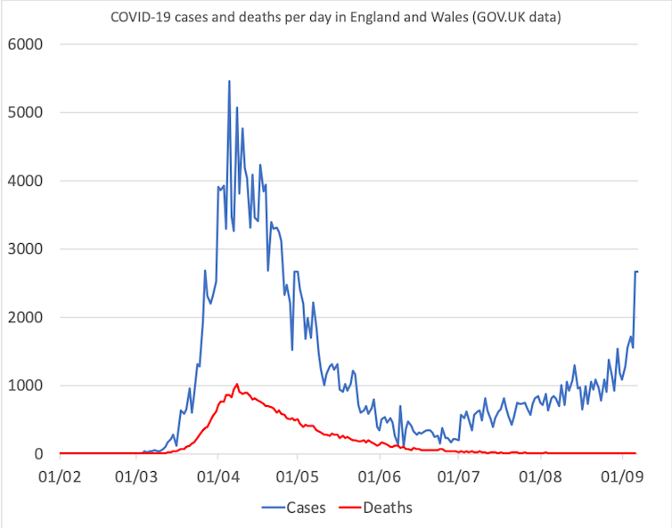
It’s important to remember that the number of cases has not been rising because the number of people carrying the disease has been increasing, but instead because more tests are being carried out, and especially in areas where the rate at which people have the disease is found to be higher. The main reasons why we know that the number of deaths has not been rising is that the actual number of cases in the population has not been rising when measured per million people tested. We know this because the Office for National Statistics (ONS) is running a properly constructed surveillance programme which estimated that by August 25 only one person in every 2,000 in England had the disease, and each week only one person in every 27,000 was catching the disease (this proportion having been essentially stable for several months). The proportion in Wales was even lower at one in 2,200. The ONS is currently increasing the sample size of its surveillance programme to 400,000 people in England with 150,000 being tested each fortnight in October. A question of demographicsIt is likely that among the steadily rising number of people who have tested positive for the disease since June, an increasing proportion are young and a declining proportion are older, so that having the disease is dramatically less lethal for each person with it. In March and April (before the June minimum was reached) younger adults aged 18-34 had the highest prevalence in antibody testing so we should not be surprised that outside of the most rigorous lockdown, cases are higher among the young. Your chances of dying with COVID-19 depend primarily on age. Those chances are greatly reduced if you are younger – as the table below shows. 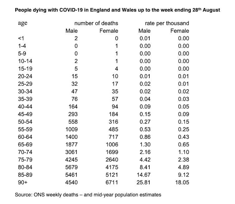
According to this data, by the end of August, someone aged 20-24 had a one in 100,000 chance of having died with a mention of COVID-19 on their death certificate; that risk doubles to one in 50,000 for people aged 30-34 and is more than one in 1,000 for men by age 65 and for women by age 75. Another way of describing what the table reveals is that a grandmother in her early 90s is 120 times more likely to have died of the disease than her daughter aged 52 who, herself, is 259 times more likely to die than her 14-year-old daughter. Currently, mortality rates for all ages are very near zero as deaths per day are so low. Cases increasing in the young and decreasing among the elderly is how the number of deaths can continue to fall even if cases found by the ONS surveillance study remain the same or even rise slightly, as long as fewer older people have the disease as compared to more younger people over time. There is growing concern of younger people passing the disease to older people, but if a young person has had the disease, and is then very unlikely to have it in future, their chance of passing it on to an older person in future is much diminished. This is another reason for not hitting the panic button when case numbers rise. Reaching a true mortality rateEventually, mortality rates from COVID-19 will fall as the proportion of people who have had it rises. The final graph below tries to illustrate just how far away from that point we are, but how we have clearly been moving towards it over the course of the past two months. The graph shows the ratio of deaths to every 1,000 cases recorded each day. This is a crude measure, as mortality lags behind positive cases, but it is still a useful guide. 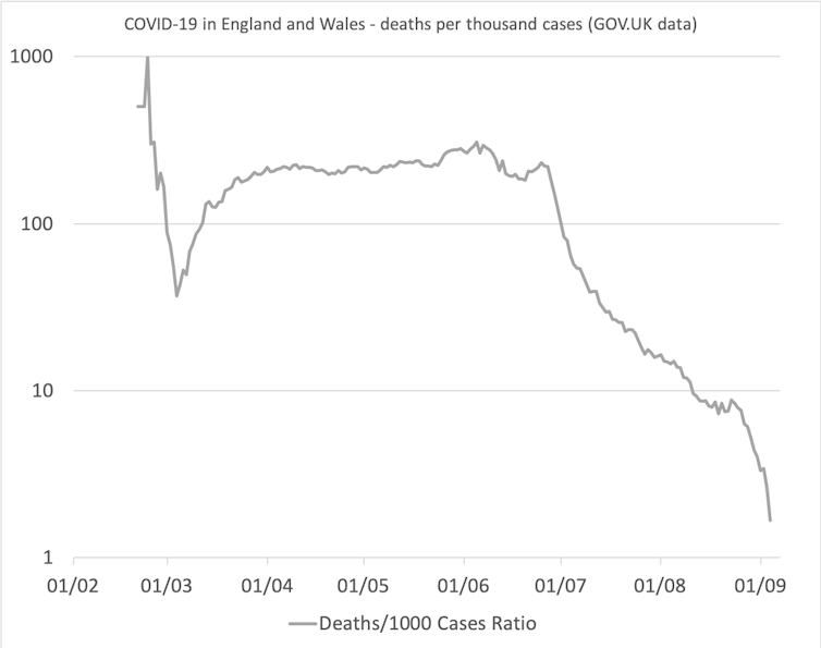
We can see that the number of people dying of COVID-19 falls from 217 for every 1,000 testing positive across all of England and Wales on June 24 (when so few people were being tested), to four by the end of August and just two per 1,000 by September 4. The fall is so fast and so great that a log scale is required to encompass it in one graph. The fall cannot continue at this rate for much longer, and where the ratio eventually settles will be below the theoretical upper limit for the actual final overall mortality rate from this disease; a rate which we do not yet know. Danny Dorling, Halford Mackinder Professor of Geography, University of Oxford This article is republished from The Conversation under a Creative Commons license. Read the original article.
The above is from the UK. From my own perspective in Austria, I see similar, the numbers tell the story on the site of the Austrian Ministry of Health.

|
OTTO RAPPThis blog is primarily art related - for my photography please go to Archives
April 2024
Categories
All
|


 RSS Feed


